Ever taken a photo you’re pleased with, only to spend longer than you’d like wondering, “what shape should this actually be?” Same here. Lately, cropping and aspect ratios have taken over my editing brain…
Cropping simply means removing parts of the photo you don’t need. Aspect ratio simply means the shape of the photo, it tells you how wide something is compared to how tall. Some examples:
- A 4:3 aspect ratio means the image is 4 units wide and 3 units tall. This format is commonly used by most digital point-and-shoot cameras and Four Thirds system cameras. It was originally developed to match the standard 4:3 computer monitors that were widely used at the time.
- A 3:2 aspect ratio means the image is 3 units wide and 2 units tall. This was the classic shape of 35mm film, and still lives on in most DSLRs today.
- A 16:9 aspect ratio means the image is 16 units wide and 9 units tall. This widescreen format is the standard for most modern TVs and online videos, including YouTube.
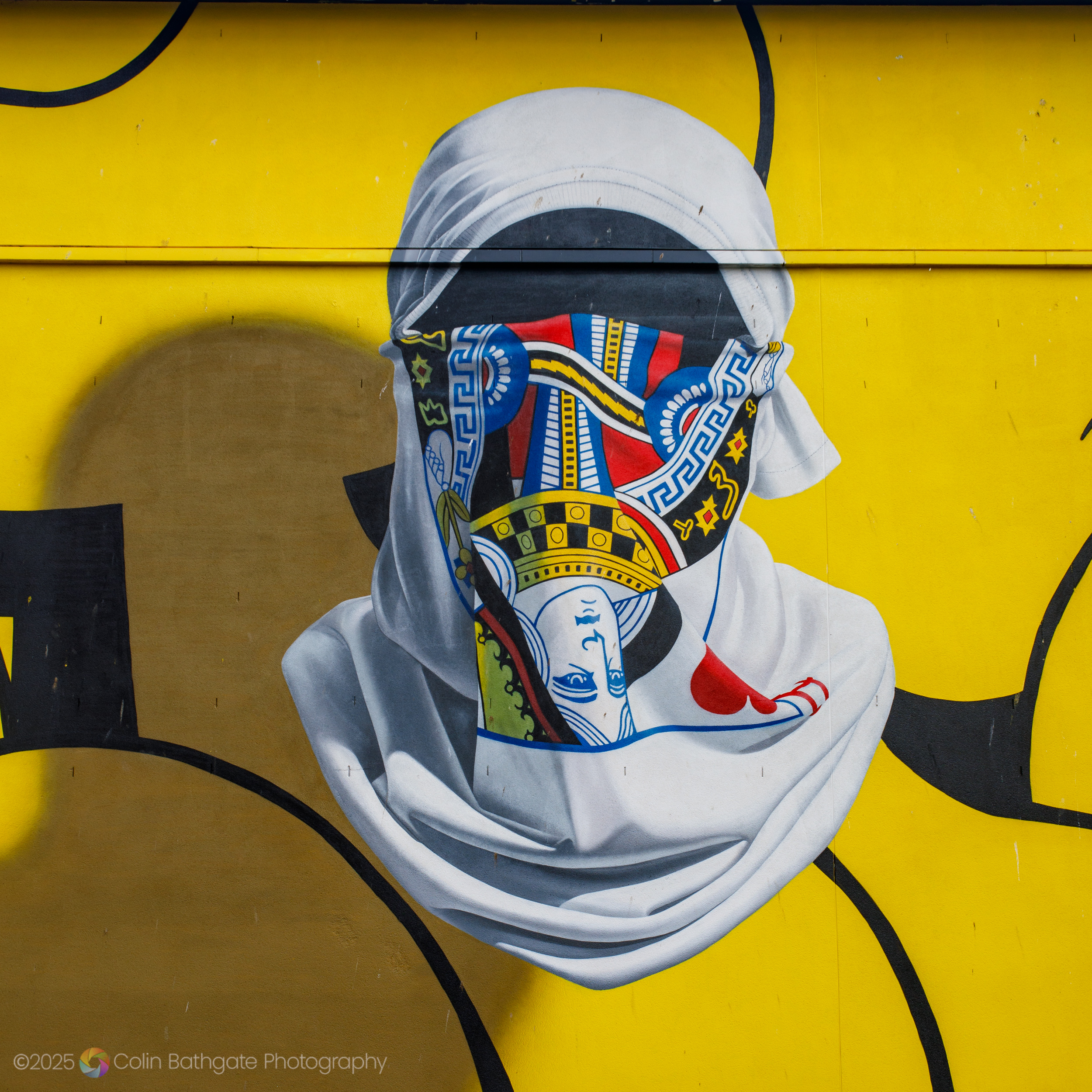
- A 1:1 aspect ratio, the focus of this post, means the image is a perfect square – equal in width and height. This classic format, made famous by Kodak, is available on some digital cameras and recalls the look of traditional film photography. Instagram originally insisted on its users uploading 1:1 images only.
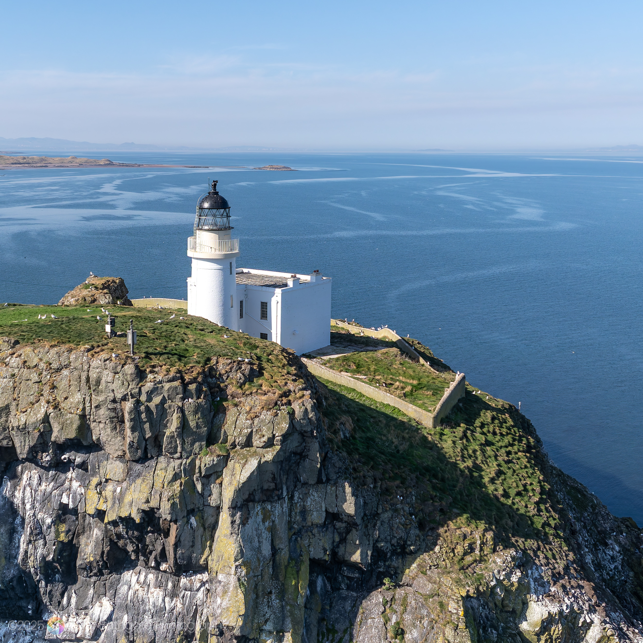
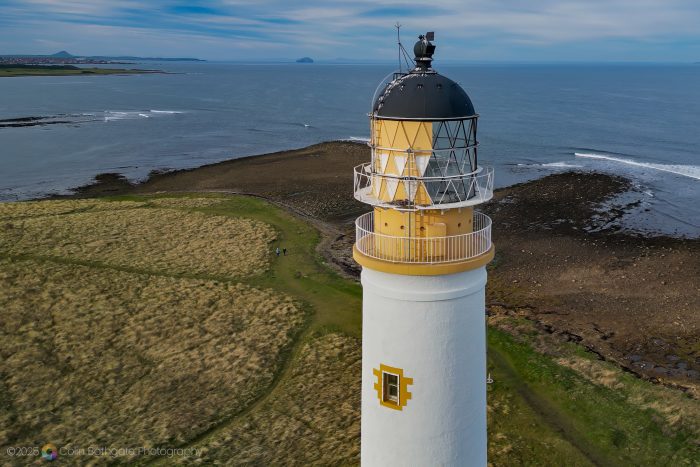
To show you how this affects a photo, I’ve cropped my original photo of Barns Ness Lighthouse to different aspect ratios, shown below.
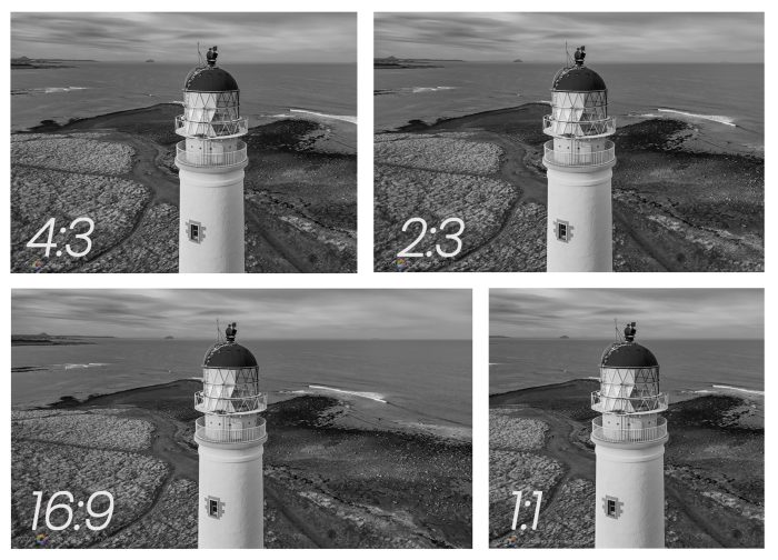
Why does all this matter? Well, as you can see, it can alter the look and feel of a photo quite drastically. Understanding aspect ratios also helps photographers ensure their images look as intended across different media. For example, if a photo is going to be displayed on a TV, a 16:9 aspect ratio would be appropriate.
When cropped to the square format as shown below, I think the image works – the focus is on the lighthouse, which is placed in the centre, and is much more direct. It also helps that it’s in black and white, but more about that later.
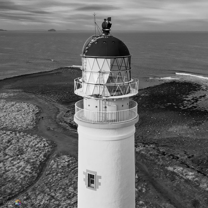
The original rectangular photo of Barns Ness lighthouse against a dramatic sky and sea looks quite good, and is shown below. This is actually a still – a single 16:9 video frame from my drone, later cropped to 2:3.
Rectangular aspect ratios naturally lead the viewer’s eye in a specific direction, usually left to right. With the square, or 1:1, there’s no wide horizontal sweep or vertical grandeur – instead, it invites symmetry, simplicity, and central composition (the subject bang in the middle of the frame).
Abstracts – Emphasising Shape and Form
Squares are great for showcasing geometry – repeating patterns, curves, lines, and diagonals. The frame’s evenness enhances structural elements – lines and shapes seem to carry more visual weight.
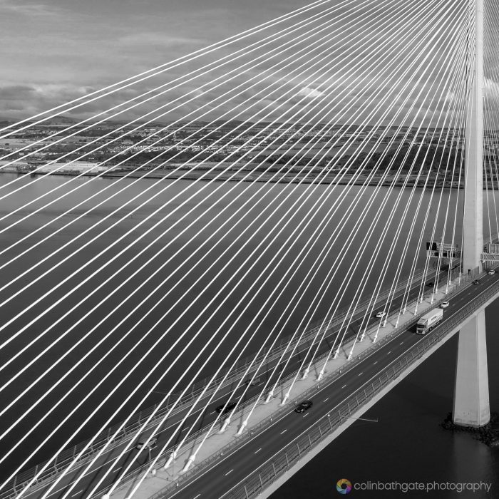
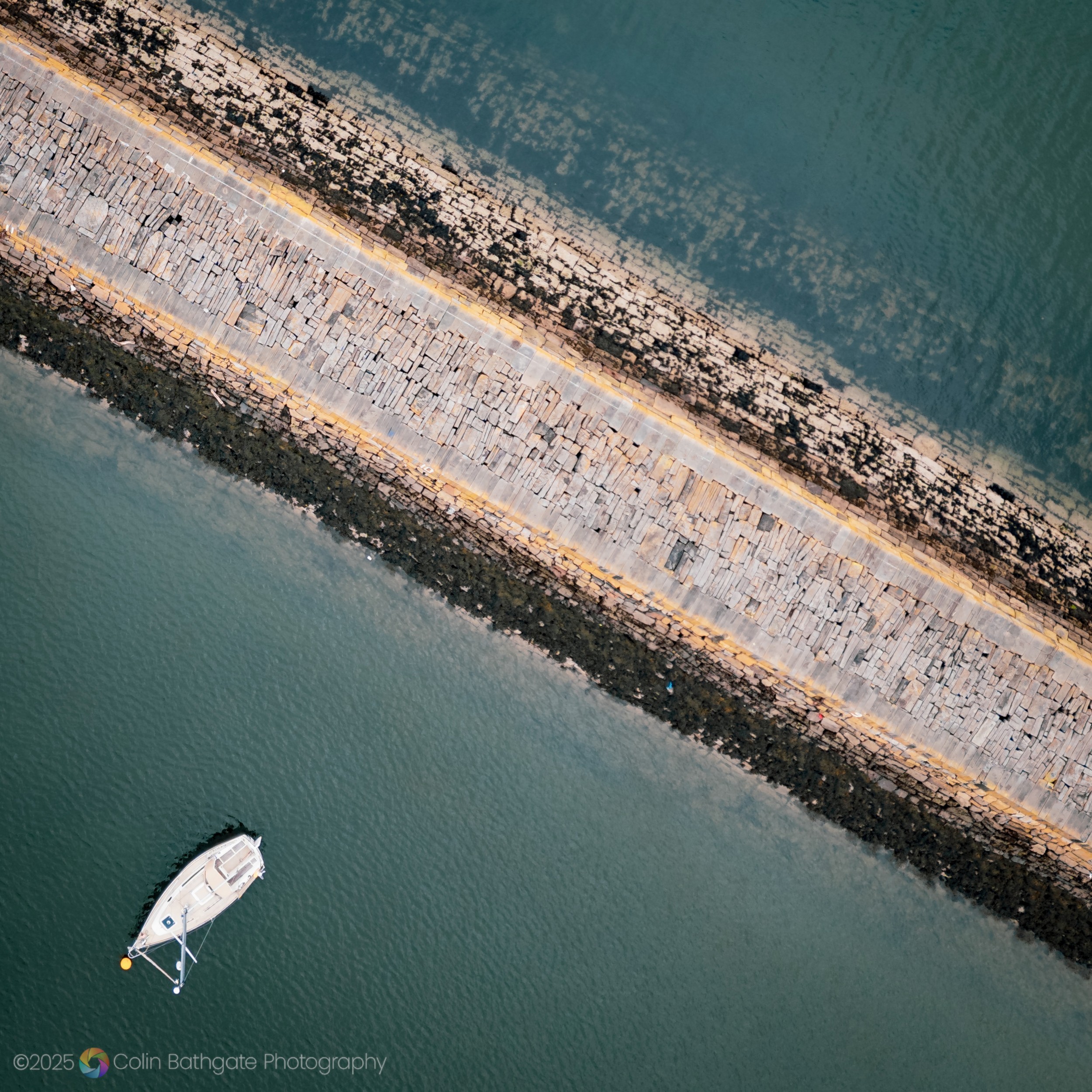
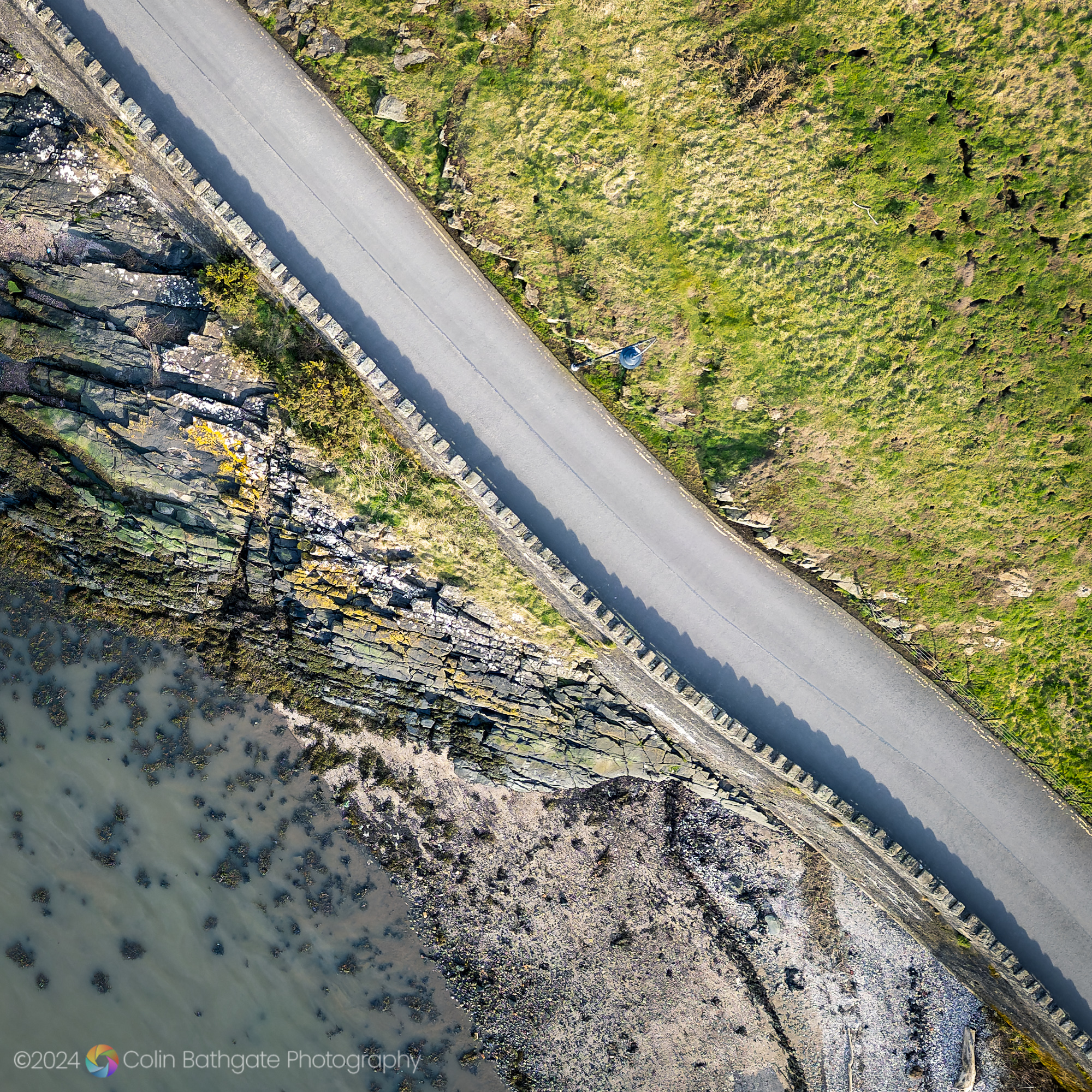
In this drone photo for example, the lines formed by the ropes on the Queensferry Crossing are given more impact in the square format than in the original rectangular image.
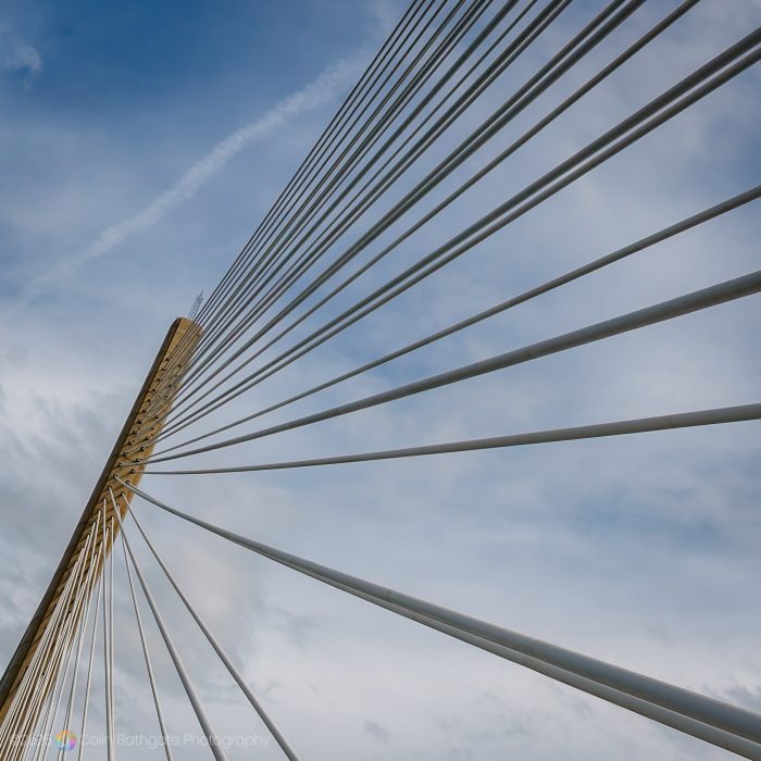
The same ropes provide a similar sort of image, but this time taken on the bridge itself. In 2017, I was lucky to have been one of 50,000 individuals chosen at random to be given a one-off chance to walk the bridge’s 1.7 miles, ahead of its official opening to traffic.
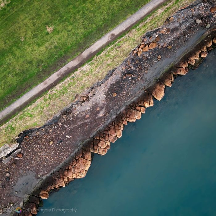
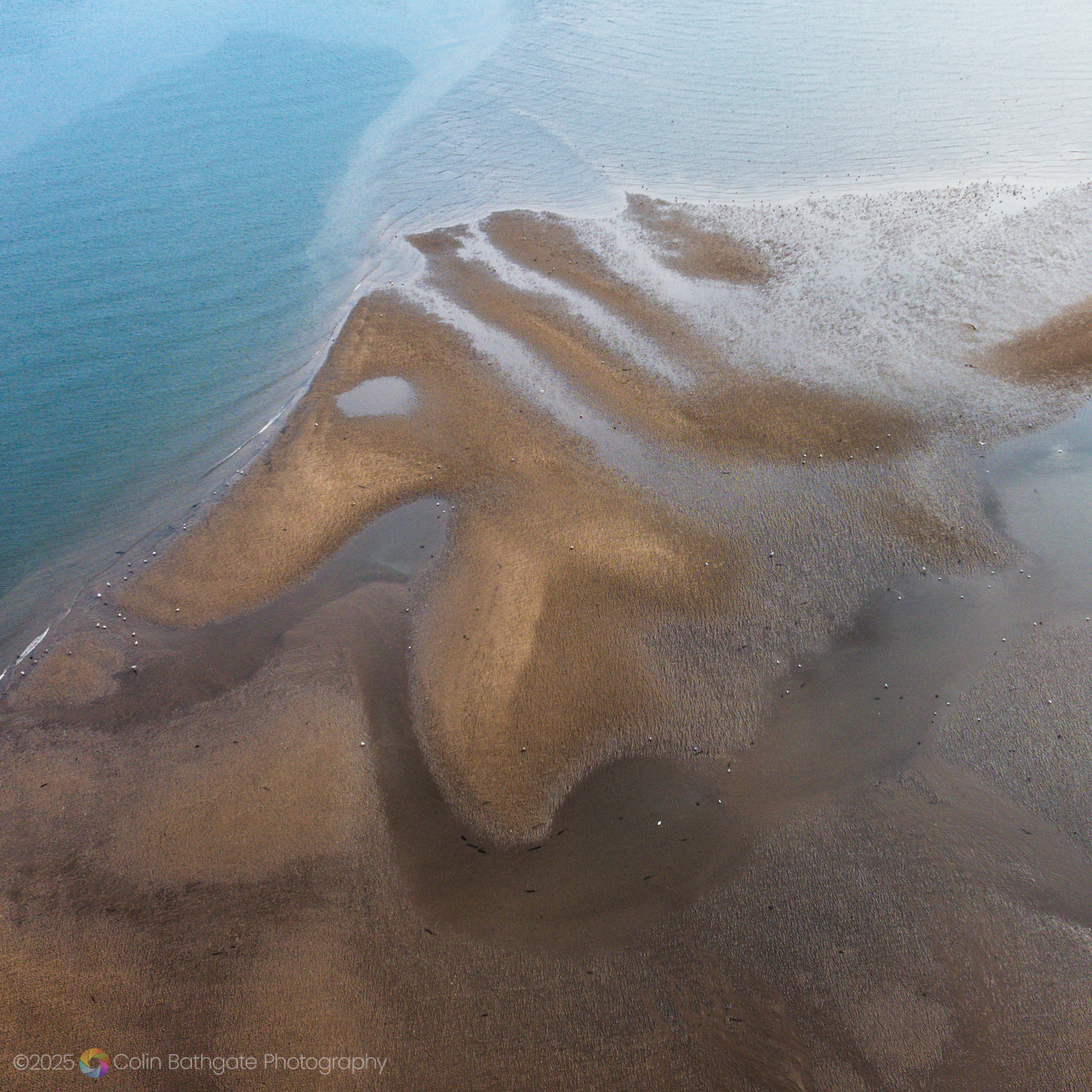
Diagonals work well, especially when leading from the corners of the square, as shown in the drone image above, taken over part of the coastline at St. Monans in Fife.
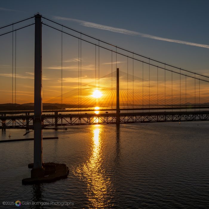
The image above, showcasing the Forth Road Bridge and Queensferry Crossing at sunset, has a number of geometric features: vertical and horizontal lines, diagonals, and triangles, and proves that this sort of landscape image can work well in a square format. I didn’t have a square image in mind at all when taking the photo, which is why it’s sometimes worth experimenting after the photo has been taken.
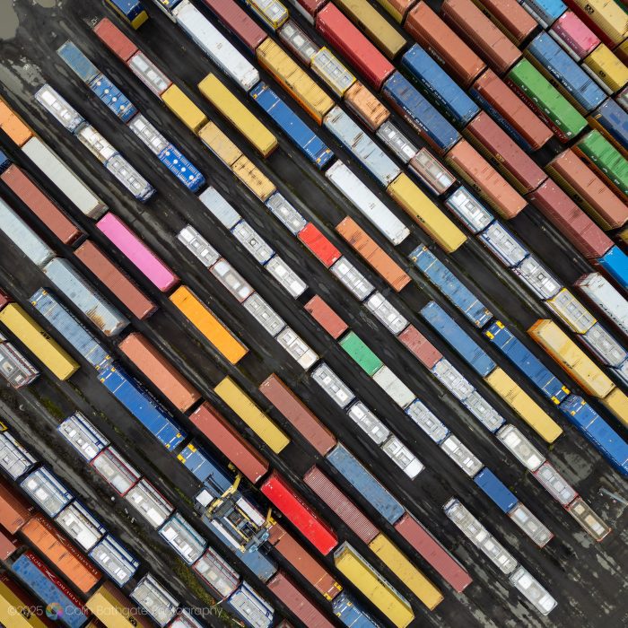
The next image also features diagonals, this time formed by the differently coloured rectangles of cargo containers at Grangemouth.
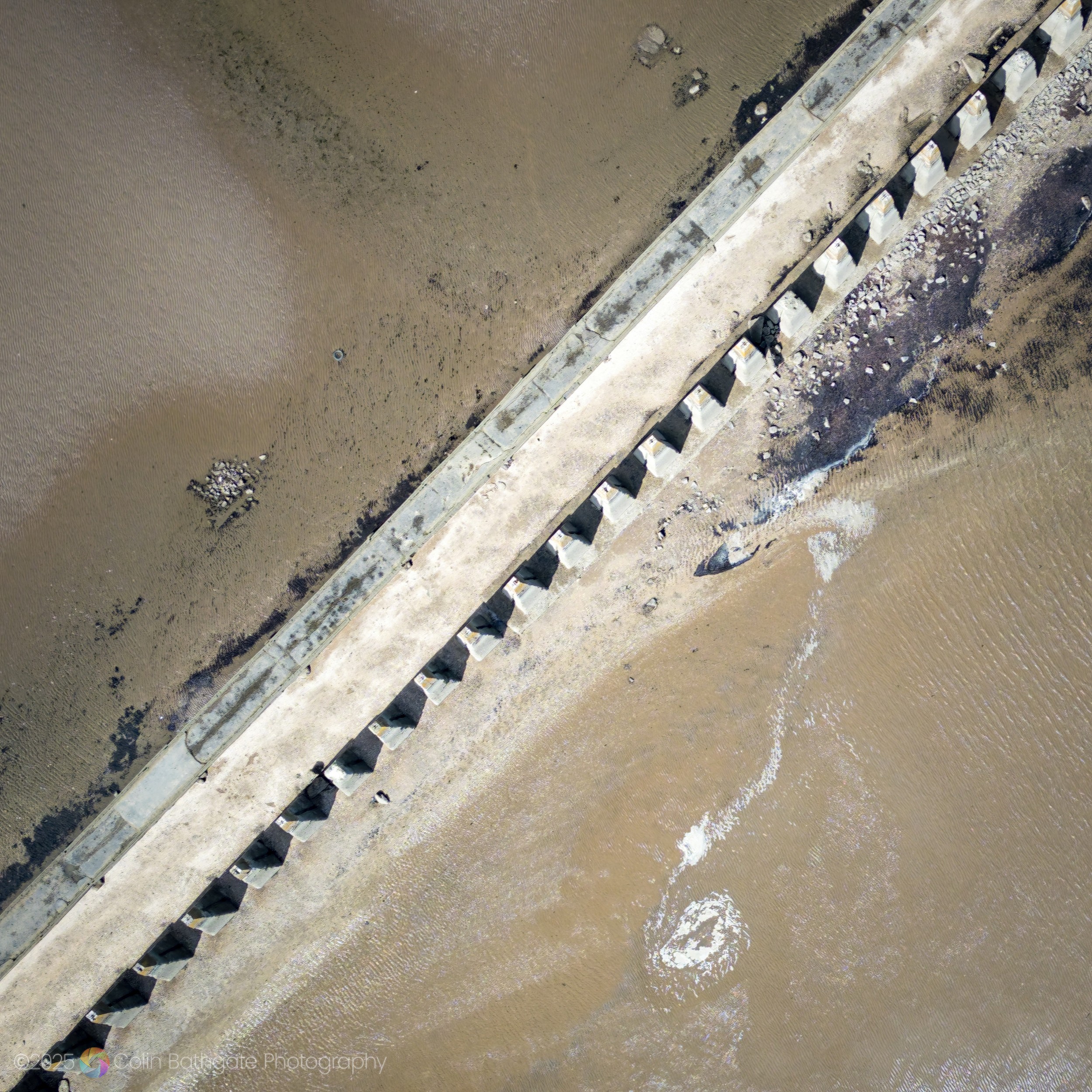
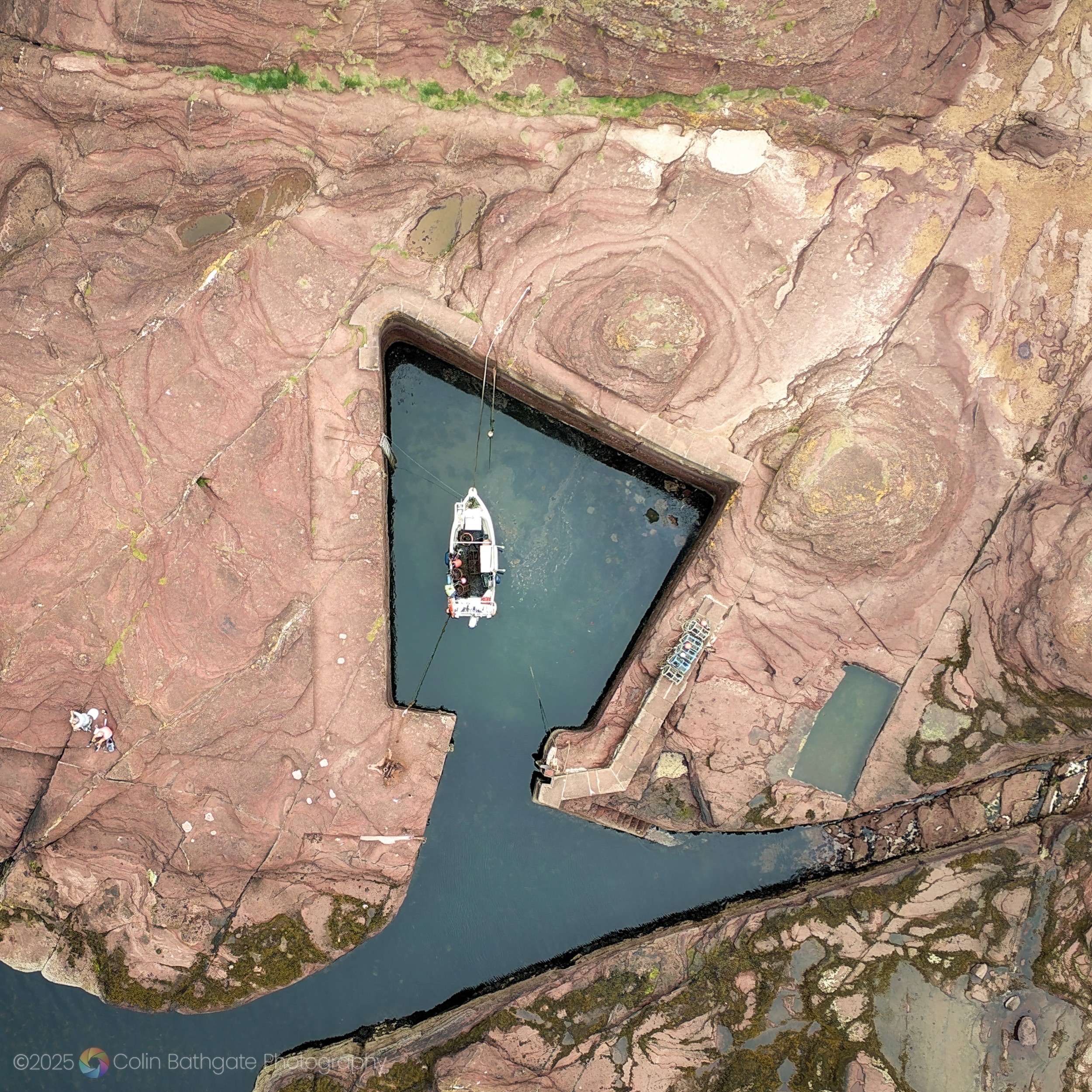
Sometimes a photo does call out for a wide rectangle – the square sometimes lacks flow or seem less immersive. If over-used, the lack of variety can become a little repetitive, something I’m aware of for this post, but I hope you’re enjoying this wallow in ‘1:1’ so far.
Circles and Ovals
That’s the joy of geometry in a square – but what about when your subject is circular? Circles are another shape that work well when placed inside the frame of a square photo.
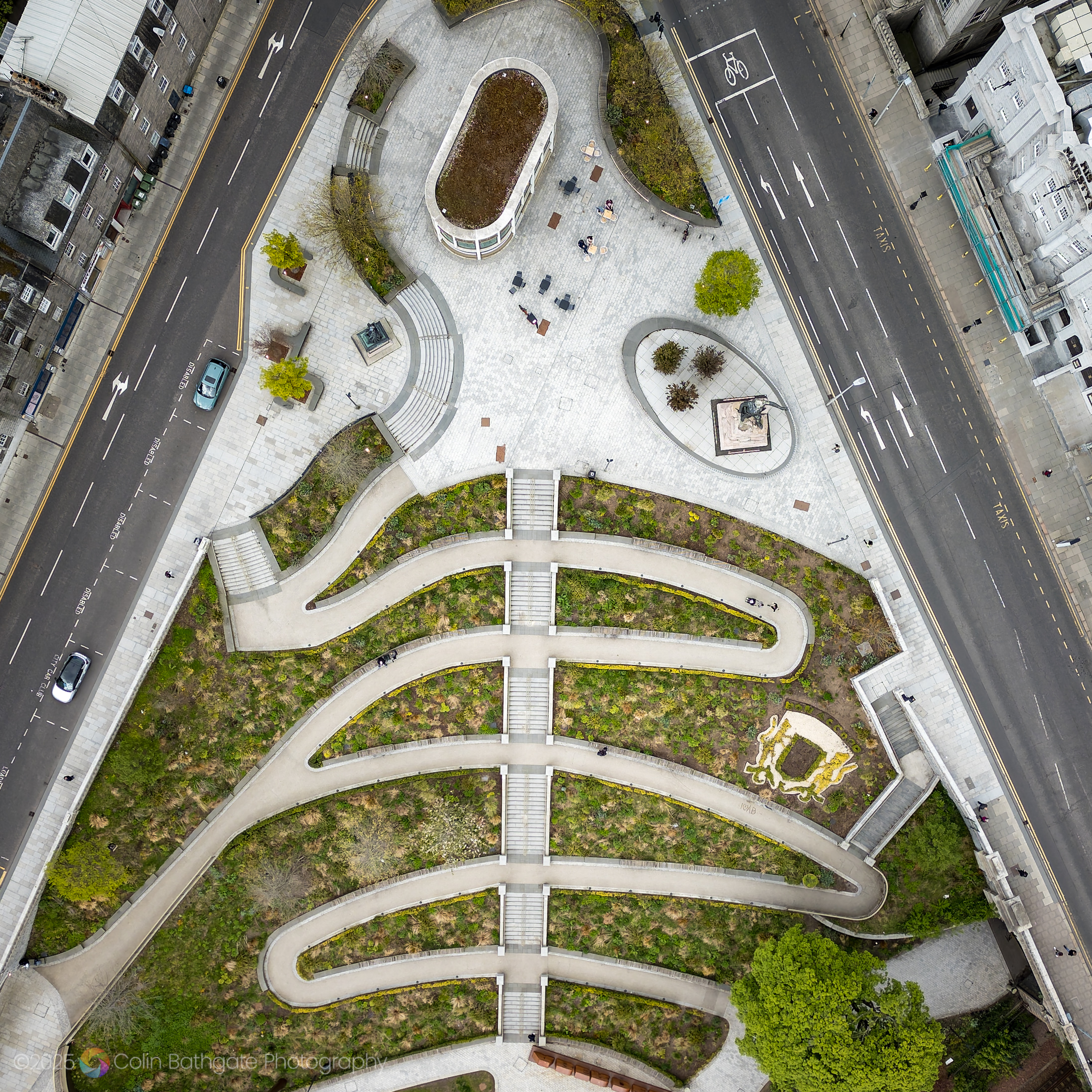
As an example, this next photo shows Golden Square (I know, it looks like a circle!) in Aberdeen. The white object in the centre is a statue of the Duke of Gordon.

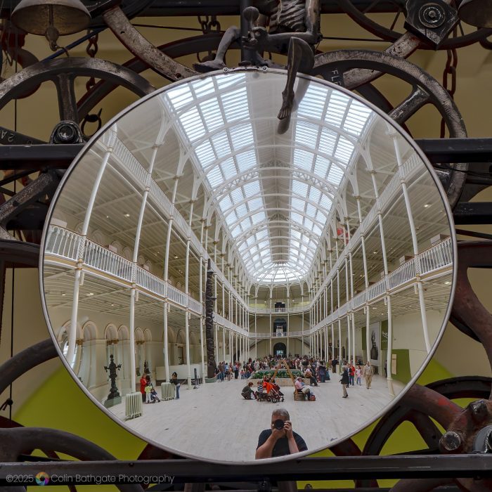
The photo below shows the great hall of the National Museum of Scotland, reflected in a circular mirror belonging to the incredible 11-metre high Millennium Clock.
Here, the Great Polish Map of Scotland near Peebles provides a near-oval shape from above, and fits nicely into the square format.

Symmetry and Centring
The square frame naturally supports symmetrical compositions, where the photographer places subjects directly in the centre. Unlike rectangles – where centring can sometimes feel static – in a square, it can create a sense of stillness, strength, or formality. Portraits, architectural details, and single-subject studies all benefit from this approach.
Here’s an example.
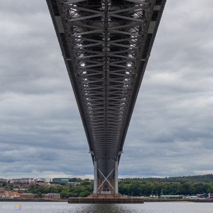
The Forth Road Bridge dominates the centre of the frame, forming a pleasing symmetry.
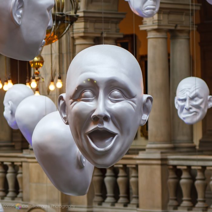
In this square frame, I positioned the subject (one of the hanging heads in the Kelvingrove Gallery in Glasgow) so it was positioned perfectly in the middle of the frame without it looking clichéd (usually it’s the ‘rule’ to offset the main subject so it’s not centred).
Black and White – When Less Says More
Colour is too noisy. The eye doesn’t know where to rest.
Jane Bown, Photographer
I wouldn’t go as far as banning colour, but I do see her point – especially when cropping to a square. You may have noticed I’ve already shown you quite a few black and white images. This is no accident. Something I’ve learned when experimenting is that black and white and the square format seem to work well together. Perhaps that’s because they strip away distractions: colour in one case, and extra space in the other.
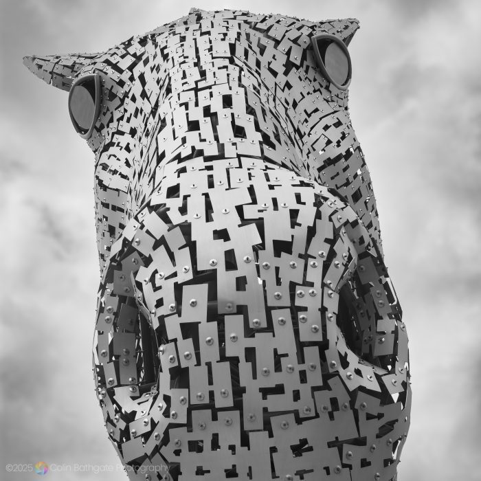
Here I placed the ‘down’ Kelpie, one of the two giant horse head sculptures at The Helix in Falkirk, in the centre of the photo, and filled most of the frame with its face.
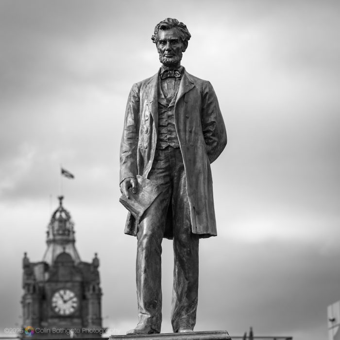
This statue of Abraham Lincoln is the first statue of any American president in Europe, and is located in Old Calton Burial Ground at Waterloo Place. I think black and white adds a timeless quality to the statue, which is also centred horizontally in the photo.
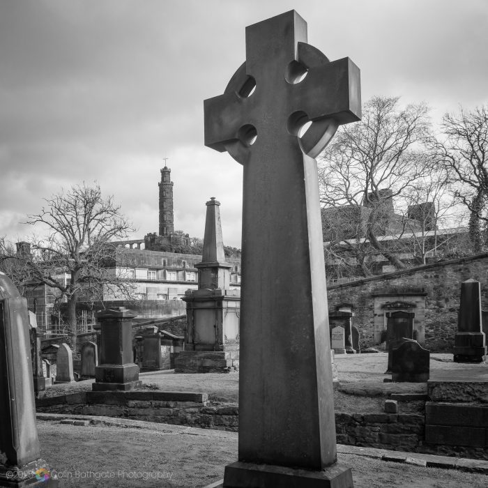
This photo was taken in the same graveyard. The large Celtic cross dominates, but is linked visually to the memorial behind it, which in turn is linked to the Nelson Monument on Calton Hill.
Ultimately, a good square image feels intentional. It’s about finding the right arrangement where everything inside the frame works together – balanced and effectively framed. Sometimes I need to experiment with the image to find the right balance and framing.
Landscapes
Landscape images traditionally suit wide rectangles, say 16:9, where the eye is swept along the rectangle from left to right. The square can also provide interesting landscape possibilities, but of a different sort.
I took this drone image of a tour boat powering away from Bass Rock as a rectangle, but it suits a square image. The stern wake connects the two elements in the photo (Bass Rock and the boat). The sea provides lots of negative space. The wider aspect ratio version of the photos just didn’t work as well for me.

I took this next photo at sunset from Calton Hill using a telephoto lens. The Tolbooth Kirk dominates the vertical, the horizontal cityscape lies along the bottom third of the photo.
Negative Space
Negative space simply means the empty space around your main subject. Think of it like this: the main subject is what you want people to look at e.g. a bird, or a person. The negative space is the area around it, like the sky, or a field.
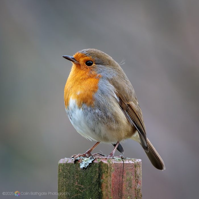
In a square photo, the shape makes it easy to balance these two spaces. If your subject (positive space) is in the middle, the space around it (negative space) can help draw attention to it. Too much negative space might make the subject feel small or lost, while too little can make the photo feel crowded.
I hope I’ve achieved this balance in the photo below of a pleasingly bulbous robin.
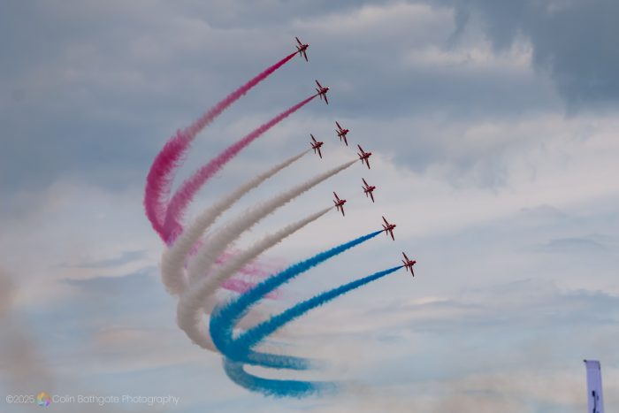
Negative space can also be a distraction. The original rectangular photo below of the Red Arrows has empty sky left and right, not adding much to the image.
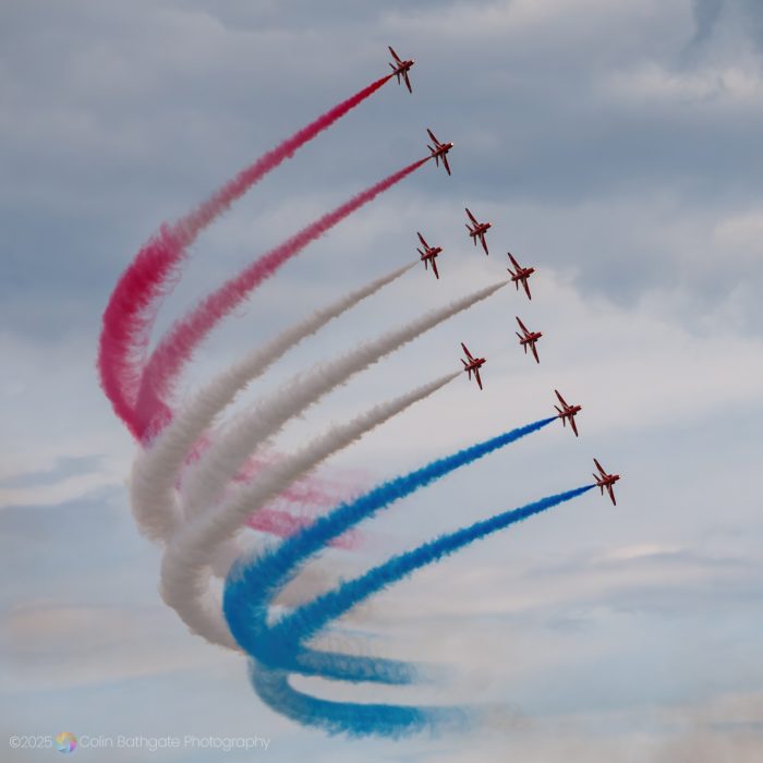
Cropped to a square, I think the photo has more impact, with the subject of the photo – the planes and the smoke trails – filling more of the frame.
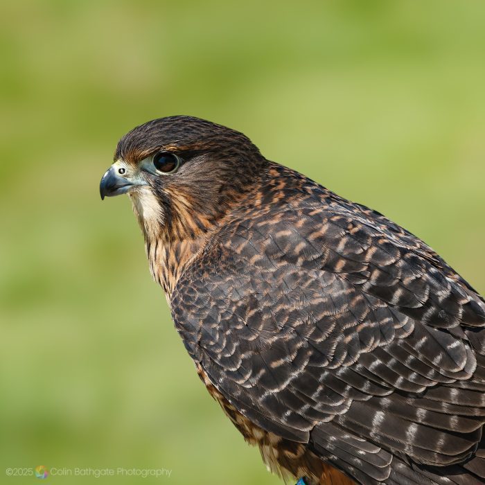
In the hawk photo below, the bird’s eye is centred in the frame. I like this one very much, it has a lot of space around the bird to the left and top.
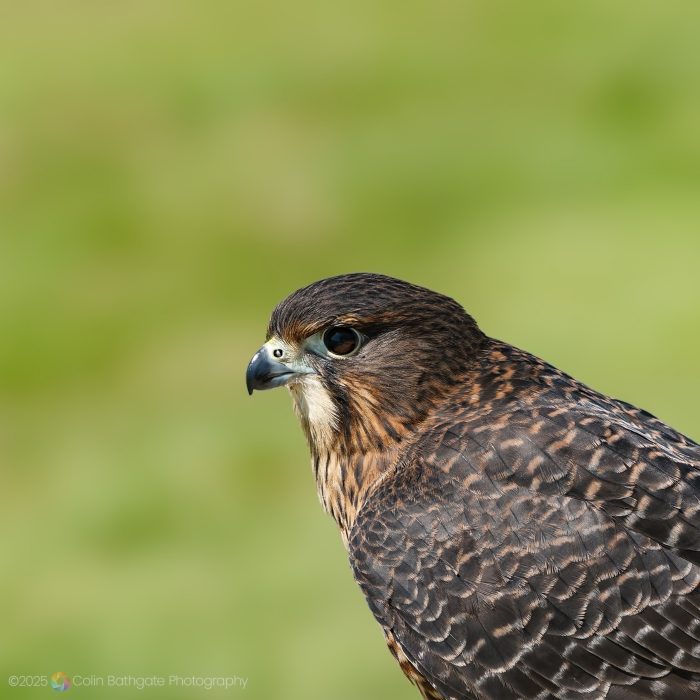
However, after I re-cropped the photo with the bird’s eye lying on imaginary lines slicing the image into 3 equal parts (the ‘rule of thirds’) I think it looks much better. What do you think? There’s no right or wrong in any of this, it’s subjective. Rules sometimes work, and sometimes they don’t.
A Brief History of the Square Photo
The square photo has long been a popular format in this country. Originating from the use of so called ‘medium-format’ (read: expensive!) cameras like the Rolleiflex and Hasselblad, the square frame offered photographers high image quality and a perfectly balanced composition. These cameras became popular in the UK in the 1940s, and during the post-war years, portrait studios embraced the square format, which suited the formal style of portraiture.
The Swinging Sixties saw the square photo truly came into its own thanks to leading photographers like David Bailey and Terence Donovan. Their medium-format cameras produced striking square images for major magazines like Vogue.
Through to the 2000s, many photographers like Jane Bown often used medium-format cameras to create powerful square images that emphasised clarity and emotional depth.
The square format experienced a resurgence in the 2010s with the advent of Instagram, which initially used a square crop by default. This digital revival introduced the 1:1 frame to a new generation of photographers, the format’s simplicity making it ideal for mobile photography and online portfolios.
I hope you’ve enjoyed this brief look at square photographs. After spending so much time immersed in the format while writing this post, I feel I may have slightly overindulged – so I’m off to look at some wide-format shots to restore the balance! Below, you’ll find links to related articles, along with a small gallery featuring a few more square images. If you’d like to share your thoughts, feel free to leave a comment in the box at the bottom of the page. There’s also a subscribe option if you’d like to receive notifications about future posts.

Further Reading
https://www.trevorsherwin.co.uk/blog/the-square-photo-format
Aspect Ratio in Photography: What You Need to Know
A look back at David Bailey’s most iconic portraits from the 60s
Millennium Clock Tower – Sharmanka Kinetic Theatre
The Great Polish Map of Scotland
Additional Photos
The gallery below provides some additional squares that didn’t make it into the post.